Picture of choices of fabrics

The right product: a story about making the right choices

Designing a product is about making lots of choices while always trying to make the best ones. 
We're going to explain a bit more about our technical, sensory and aesthetic choices!

Picture of first sketching products

Product feasibility: is this going to work?

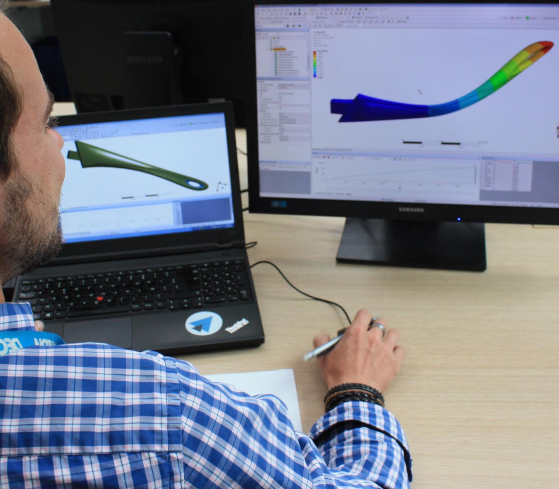
Our design team make the future product a reality.There are already its main features thanks to computer-assisted design (CAD). And with the 2D/3D drawings and the first prototypes, we also checked it complies with the specifications..

Last step: evaluate feasibility.. To do so, we ask ourselves several questions about the aesthetics, the components, the technical skills, the right manufacturing price, the patents, etc.

Once we've carefully checked all these, there are either two options: do we go with it or not!
If the feasibility is approved, it's go. We launch the first prototypes.
If it's not approved, we rethink the product, or certain product aspects and its design to pursue the project.

in the picture: CAD helps us to materialise the first sketching.  

Picture various fabrics and textile  on a tables

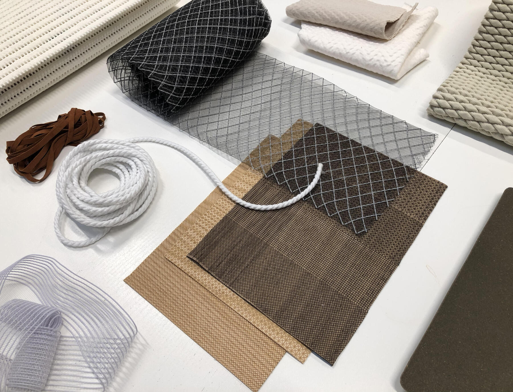
Technical choices: product components

If the product is feasible, the design team starts with technical choices.Among these are the product's components in other words its materials. Thanks to teams dedicated to developing these on a daily basis, we have our own catalogue of specific and exclusive components. It helps us to guarantee all the manufacturing steps.

We categorise everything by product benefit to make our design teams' job simpler. A product benefit can be:warmth, windproof, stretchy, recycled fibres, etc. More practical to work out when you need a component with specific features!

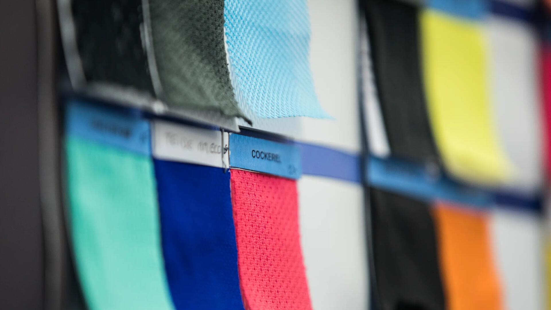
Picture fabrics and colorful textiles

Sensory choices: feel and feelings

There are technical choices.And there are sensory choices.When put like that, it seems a bit conceptual. Allow us to explain:

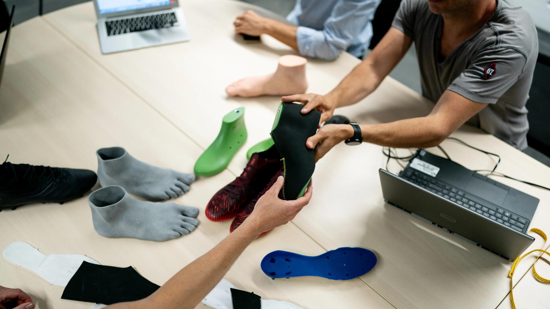
To determine the sensory choices, it's about asking sports users what they need to be able to choose the right materials. To do that, we ask ourselves questions based on the 5 senses: does the material need to be coarse, soft, smooth, shiny, matt, super soft, etc.? Put simply: what must you feel when you use the product?

You'll get a clearer idea with an example: a tennis or badminton player needs a racket with a grip with the right texture to get a good hand grip. If the grip is too smooth, the player might think that it won't provide a good grip, without even having tested the racket on court. Conversely, if it's too coarse, he or she will have the impression that it won't be pleasant to play with. It's a question of feel (in this case we're talking about touch) and feeling.

Picture shoe prototypes

Spotlight on the sportslab's sensory tool

The textile process team and the Sportslab's sensory sciences lab have developed a sensory tool: Inside Out. Used by all sports, it helps to stay in sync by using the same vocabulary, the same evaluation protocols and the same rating scales when talking about our components. And it's also thanks to this tool that we conduct sensory studies.

Aesthetic choices: colours, cuts and print designs

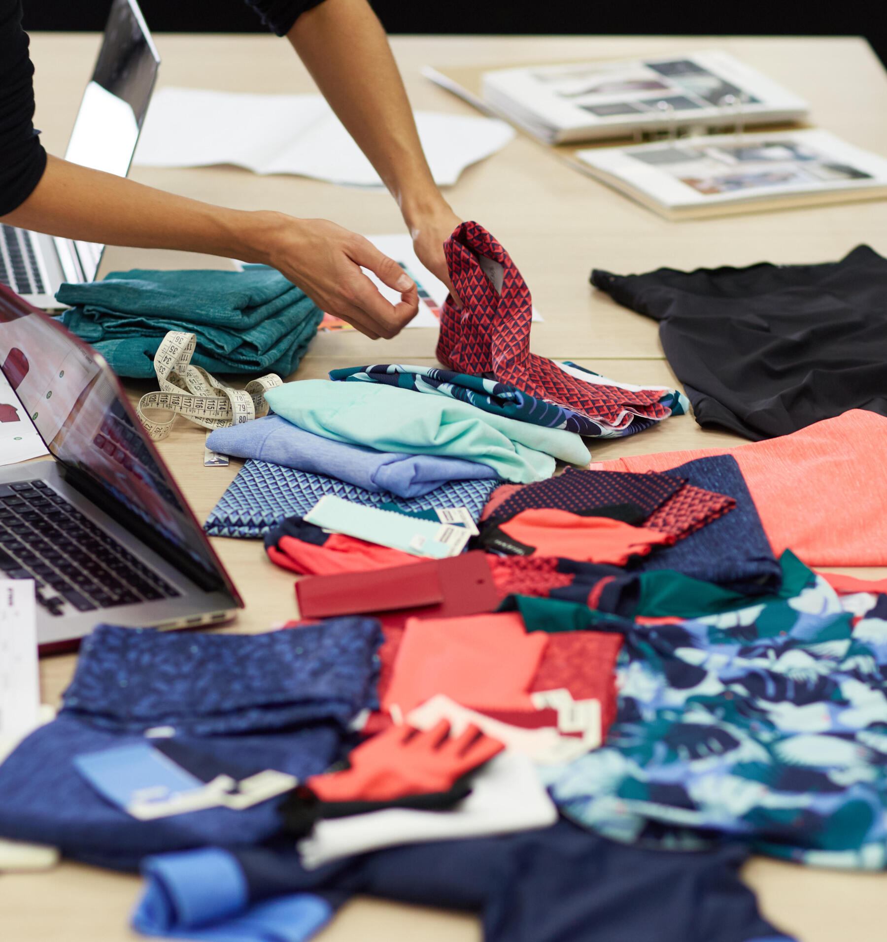
Once the technical aspects are approved, the designer moves on to the style of the product and the future collection, in short, what the sports users see first! A team of experts assists them in making the right choices. Together, they determine the right range of colours, print designs and weigh in with regard to the choice of components, and the trends to follow.

The designer also surrounds themselves with sports users to confirm their choices. They sometimes call upon a panel of users, always listening to their preferences.

The product must appeal to sports users and trigger an emotion. They must also be in harmony with the rest of the collection. The idea is to have an eye-catching homogeneity when everything is lined up or in the sales department. And highlight the product benefits thanks to its aesthetics. It must also be: sporty, responsible, friendly and essential to match our values!

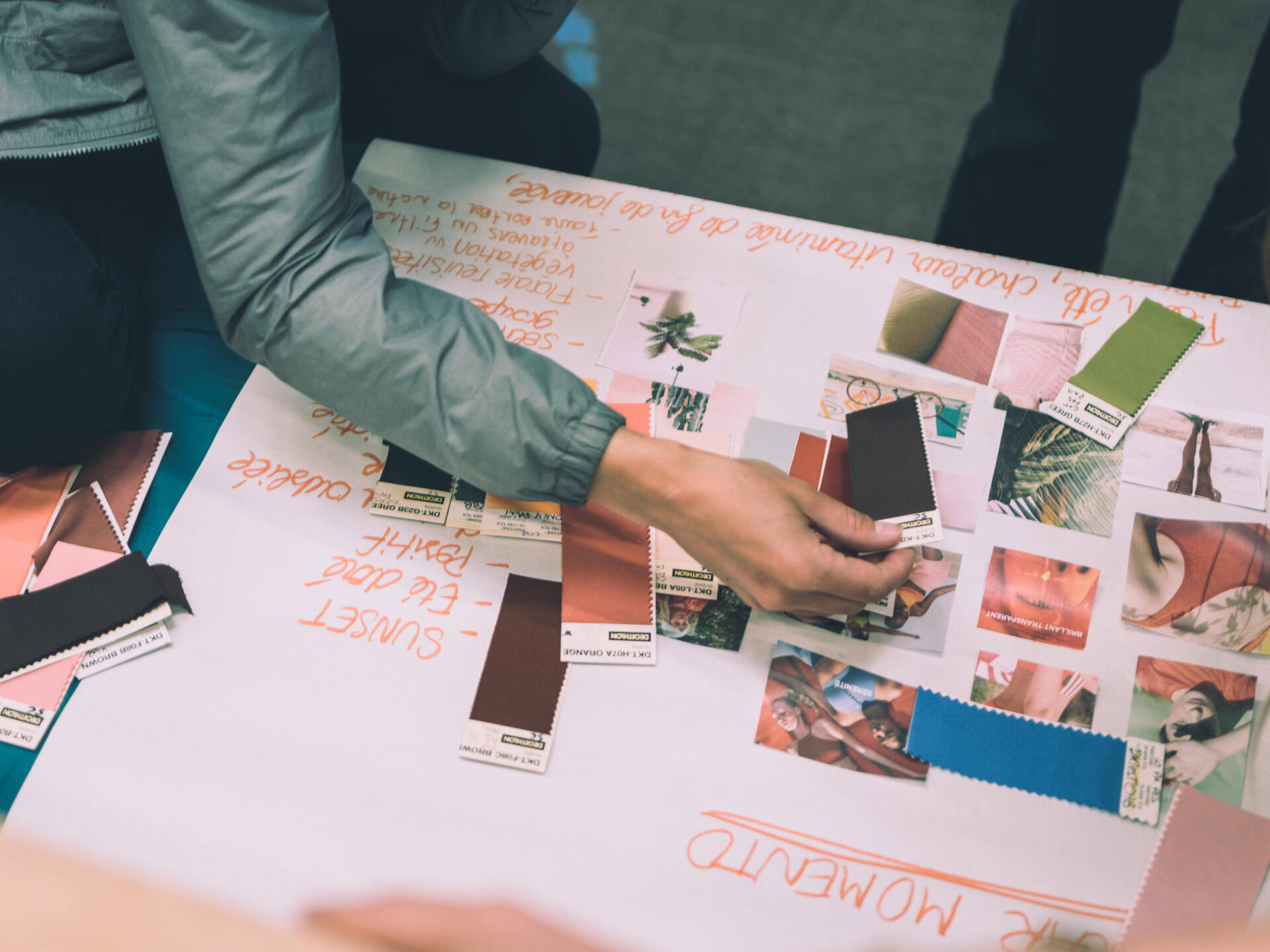
  • Picture moodboard with colors and inspirations

    The team dedicated to style establishes a range of colours for the trends to come.

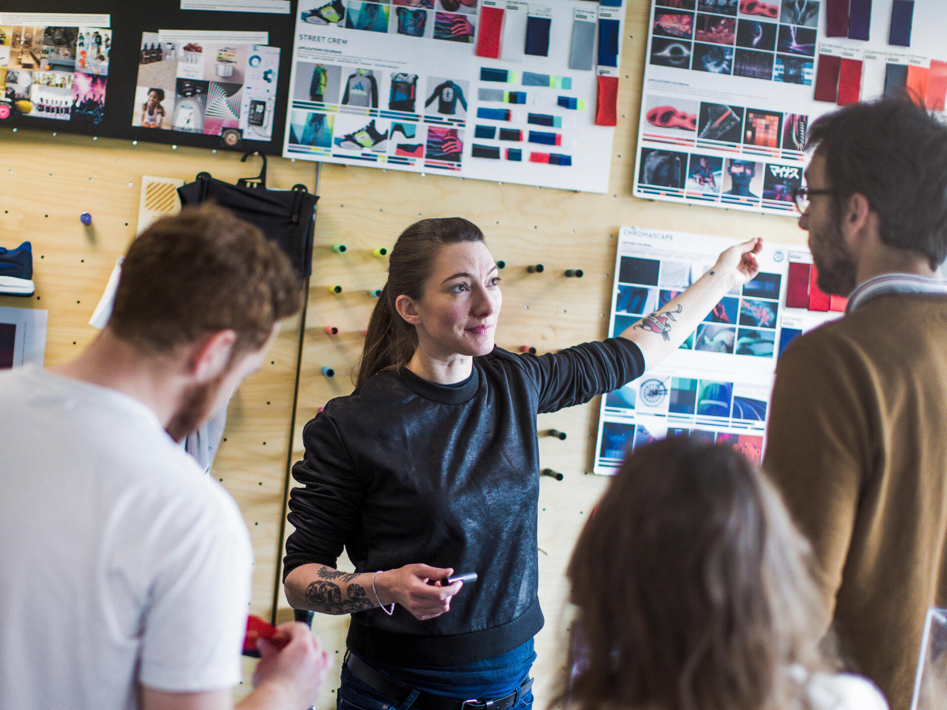
  • Picture of a woman in front of textiles samples

    A designer from the Artengo team presents their trend, colour, material and print design choices.

Picture textiles samples

Spotlight on the "colour range", our colourful catalogue

DECATHLON isn't just about blue.And yes, we developed our own colour catalogue. Why? To get more uniformity in our collection, whatever the own sports brand, and in our sales departments. But also to have the same colour, the same red or blue, for example, whatever the material: plastic, cotton, polyester, paint on metal, etc.

How and where does it happen?
There are rooms, in each of our design centres, equipped with LED reproducing daylight and the light in our stores to compare colours in both environments. What's their purpose: letting us check that the customer perceives the right colour and that they won't be disappointed once outside with the product.

The DECATHLON colour range is 300 colours, and that's it!It makes it easier to match the items of our different own sports brands!

PS (we know you're curious): there are 12 reds in our colour range. And 37 blues.

AND... IT'S APPROVED!!
Once the right choices are settled, the engineer orders the materials in the right colours.And the industrial prototyping phase can start.With this first industrial prototype, the design teams confirm once and for all their choices or make new changes if the result isn't satisfactory.

Next step

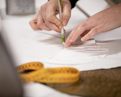
Picture pattern drawings

Technical formalities and industrial prototypes

The technical, sensory and aesthetic choices are approved! The product concept is functional. Our teams have taken decisions about the price and the manufacturing location. Next step: formalising the request. And providing the supplier with a technical file to start the industrial prototyping.